What we do
WEND
Client
WEND
Categories
print / brand
Challenge
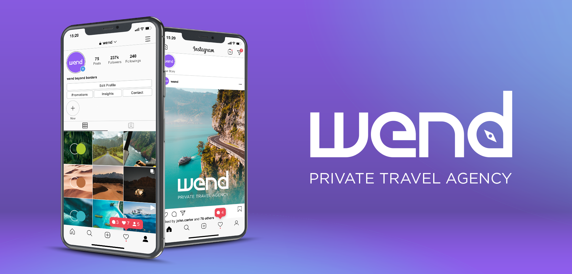
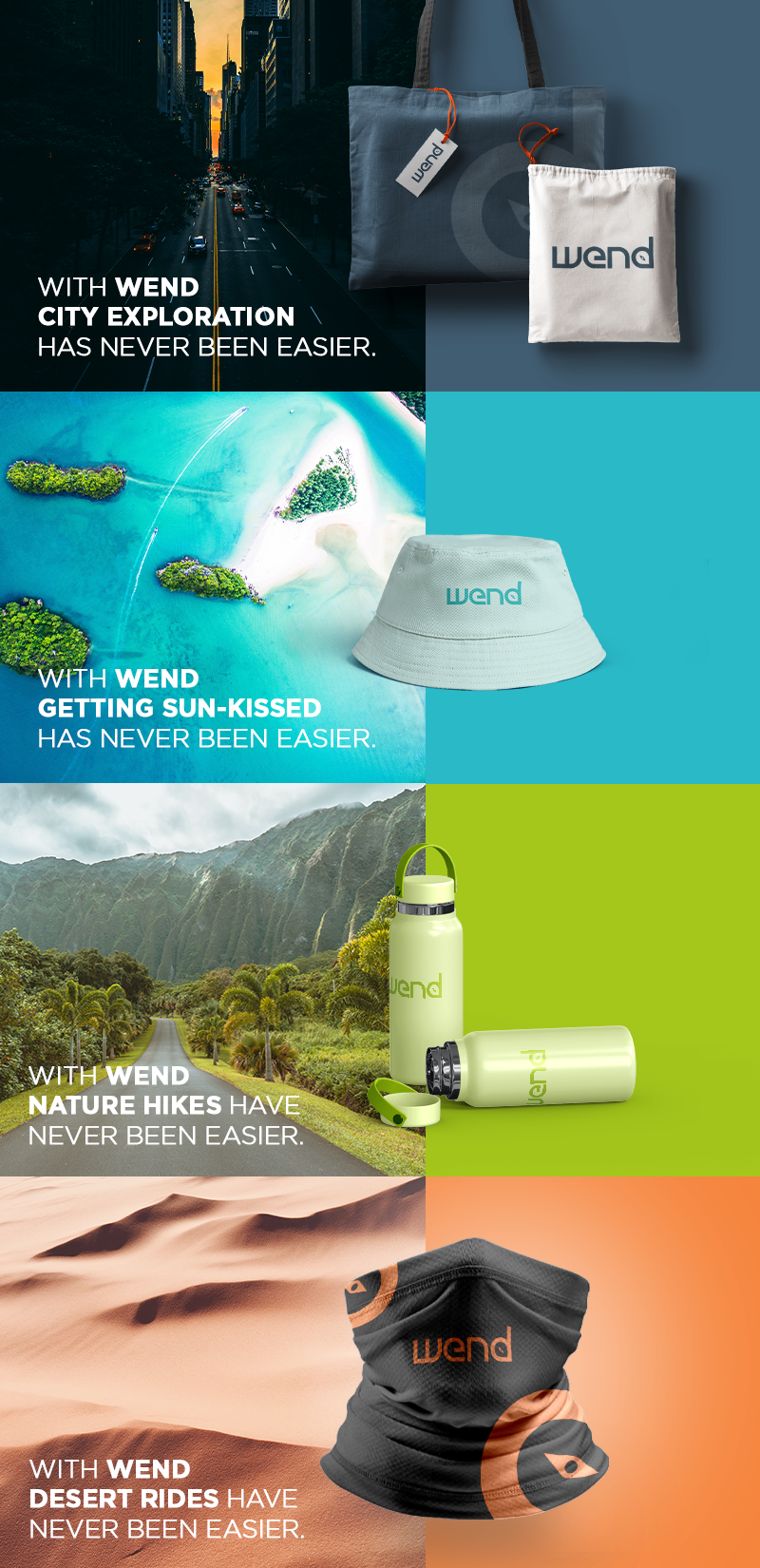
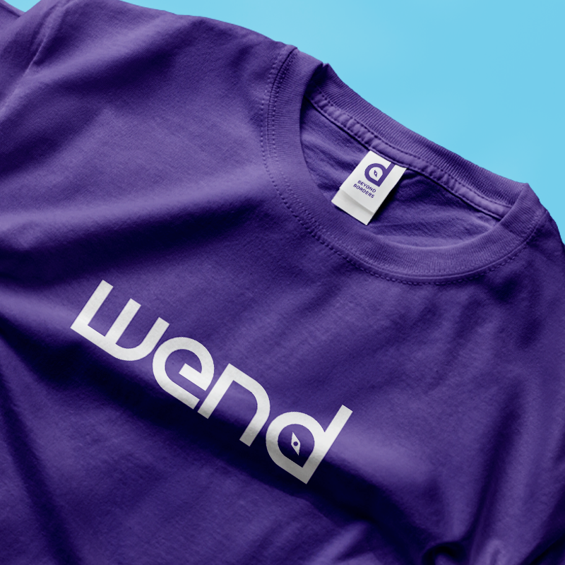
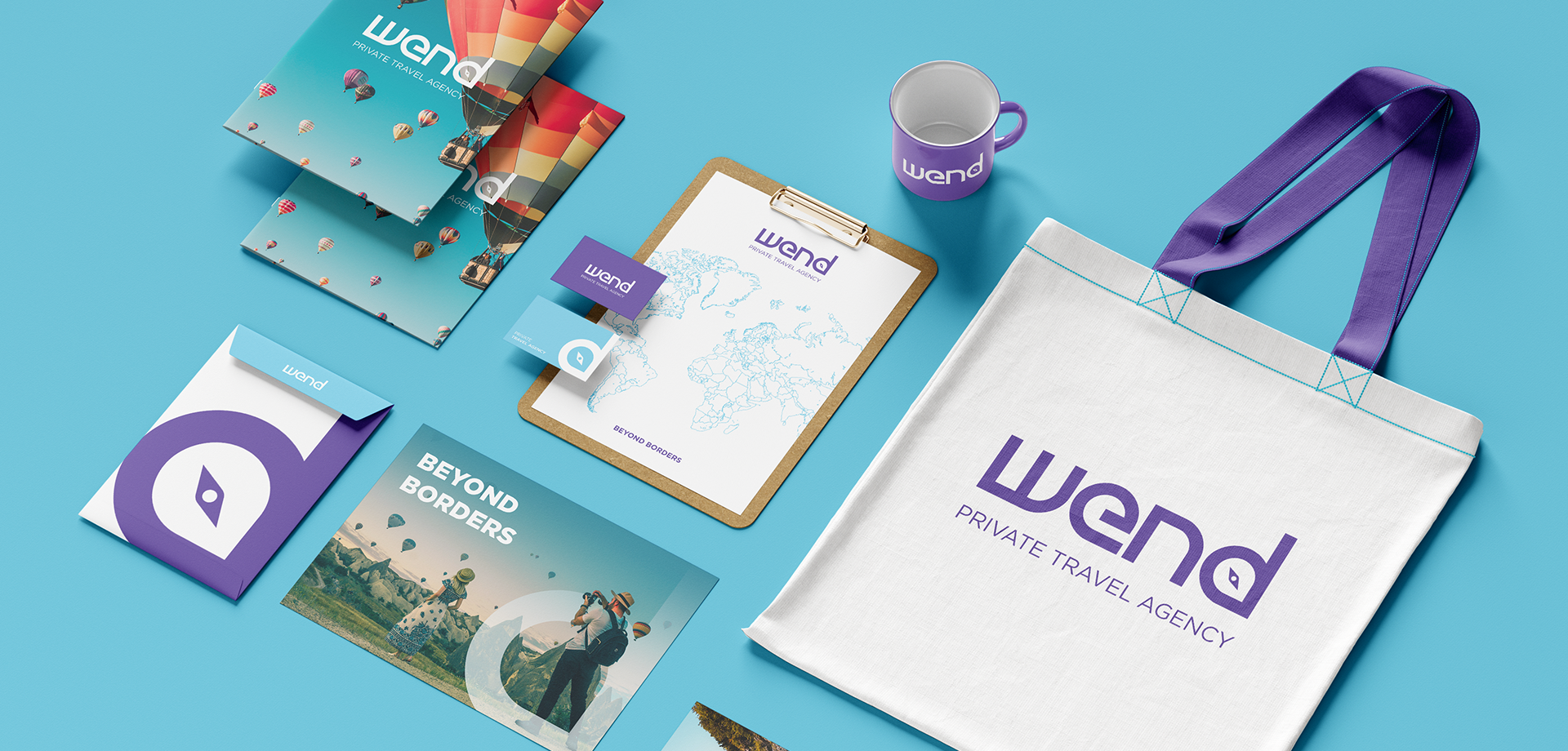
To develop an identity and a new naming for an existing private travel agency.
Solution
We rebranded this travel agency by developing a simple logo inspired by travelling routes and paths with a stylized compass related to orientation and a short name inspired by its owner, Vera. The color palette was also a crucial point to take in consideration in order to differentiate the brand from the most and to make sure that, just like travellers, it could live anywhere.
All
Branding
Activation
Print
Digital